Soho House / UX, UI & branding
A sense of belonging.
Even online.
Exploring how the character of Soho House could carry into its digital world.
- The brief
- Redesign & replatforming discovery
- The scope
- Research · UX · UI · Branding
- The output
- Digital foundations & two concepts
Project outputs at a glance
Distinct creative directions for the digital brand.
User goals prioritised through discovery and mindsets.
A component-based foundation for the group’s digital sites.
Outputs documented in the original case study. Post-launch performance measures were not provided.
More than
a new website.
The brief brought two questions together: how should Soho House and its affiliated sites be redesigned and replatformed, and how could the brand evolve for digital use?
The work moved from understanding users and defining a first release to exploring two creative directions. That connection between experience and expression is the thread running through this project.
Understand the needs.
Then find the expression.
Start with people.
Give the work direction.
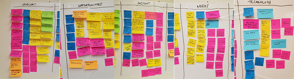
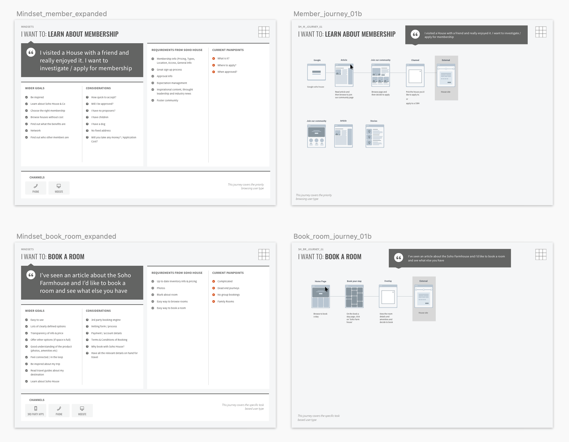
Discovery brought users, contributors and competitor references into the same conversation. A POINT exercise, benchmarking and user mindsets helped establish the priorities for a first release.
The purpose was to give the redesign a clear starting point before moving into templates and visual concepts.
Listen & learn
A POINT exercise with existing users and site contributors.
Look beyond the current site
Competitor analysis and a benchmarking review.
Set the priorities
User mindsets and goals to inform the first release.
A shared structure.
Room for difference.
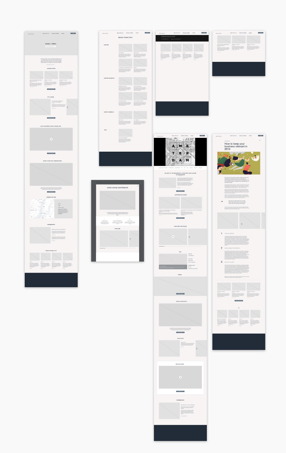
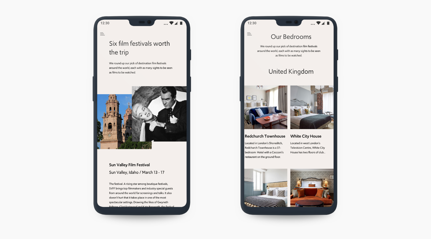
The next step was to identify templates built from a specially designed suite of components. The intention was a set of patterns flexible enough for the group’s different sites, with a structure that could scale.
The proposed platform was Sitecore. The template work connected the discovery priorities to a practical direction for the digital experience.
Keep what feels familiar.
Open up what comes next.
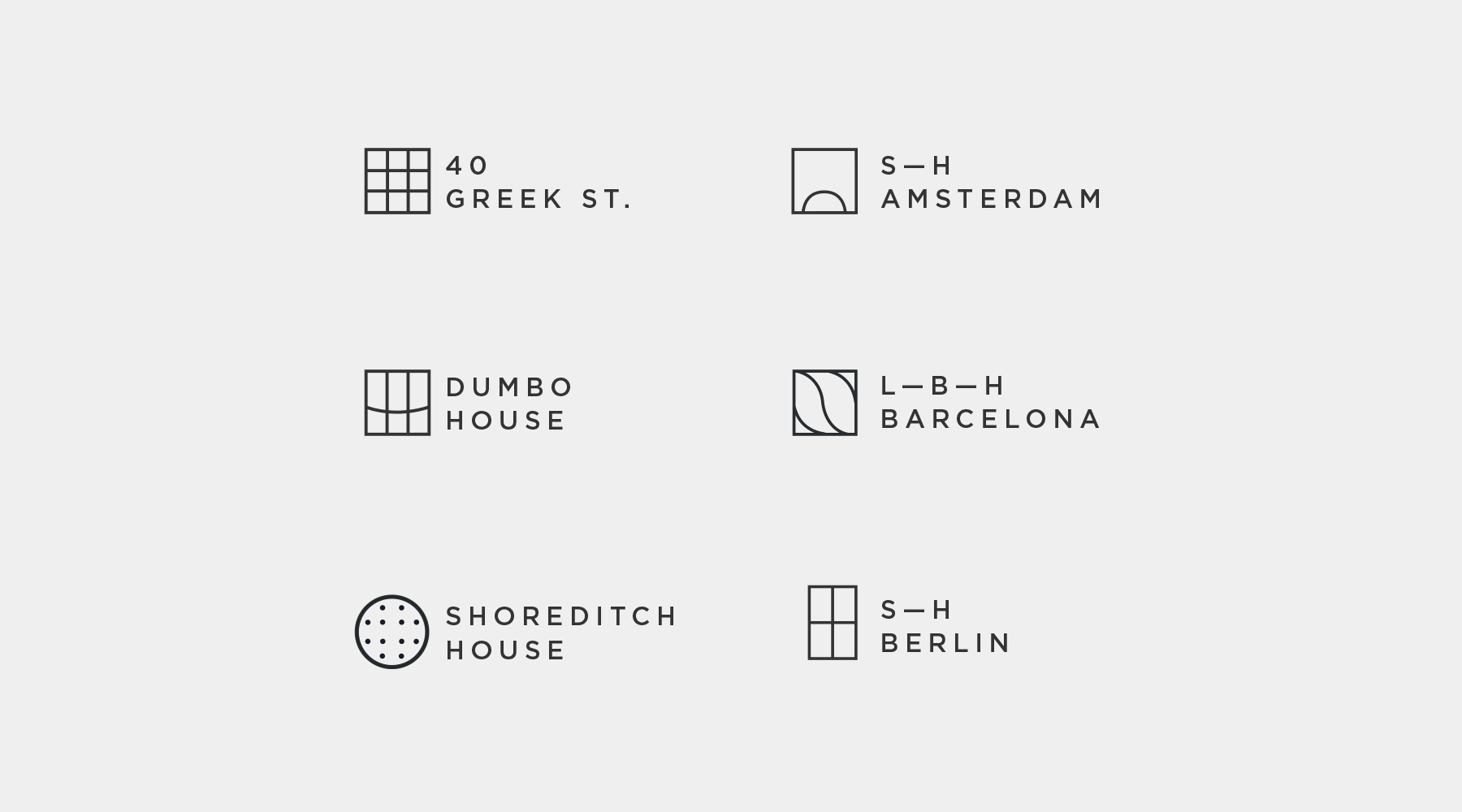
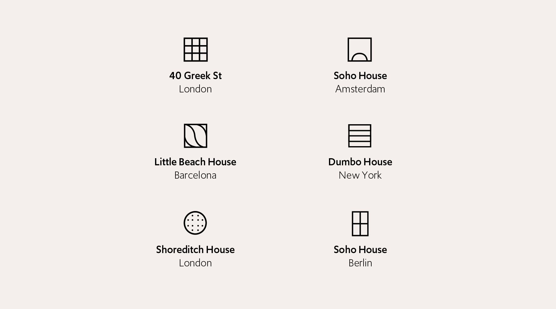
With the foundations established, the focus shifted to the brand. Existing elements, including the House icons, became starting points for a refreshed digital expression.
Two concepts explored different aspects of Soho House: the connections between people and the creativity found within its spaces.
One brief.
Two ways to feel at home.
Connecting
People.
A visual idea built around the connections made within, and through, Soho House.
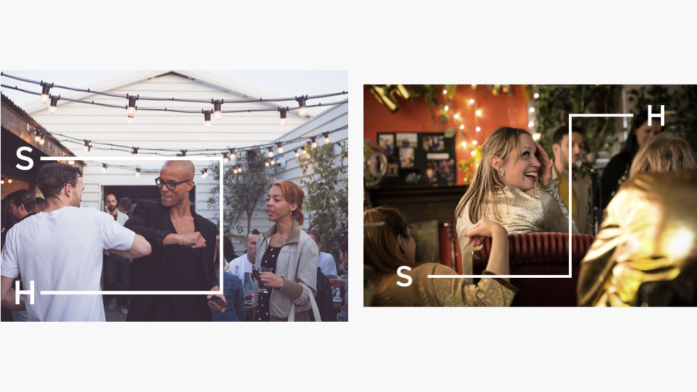
A connection that
makes room.
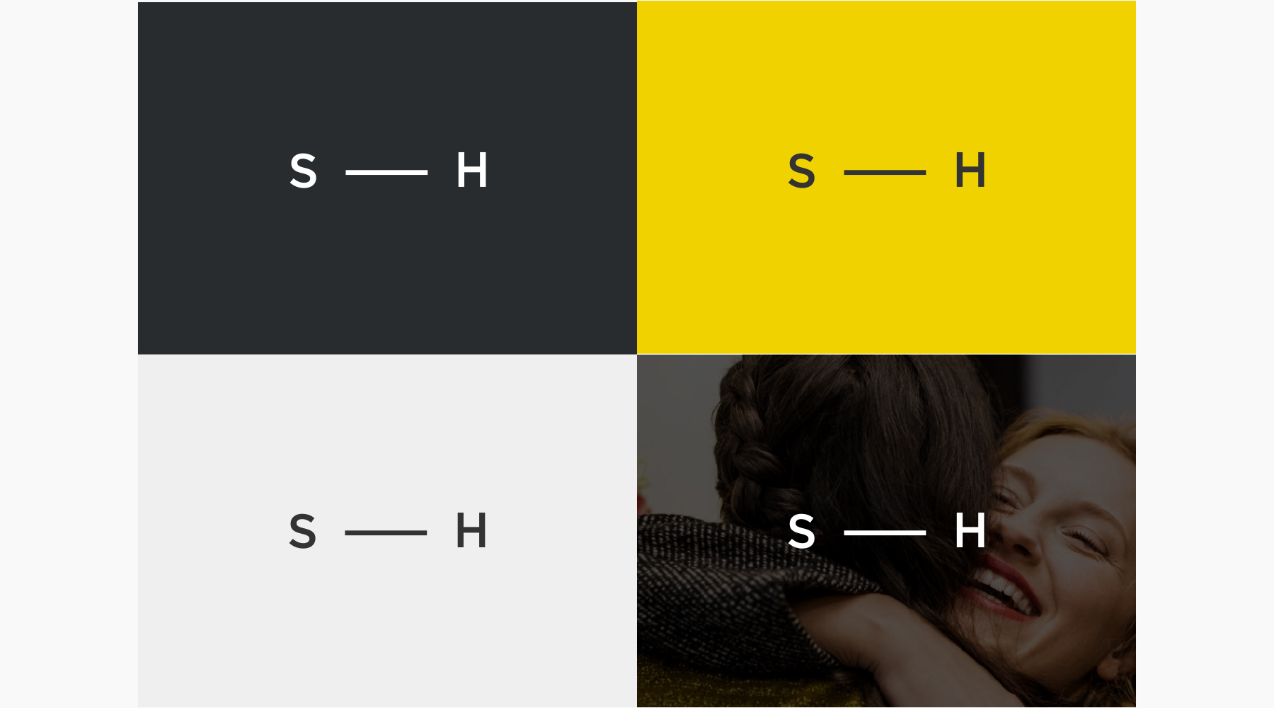
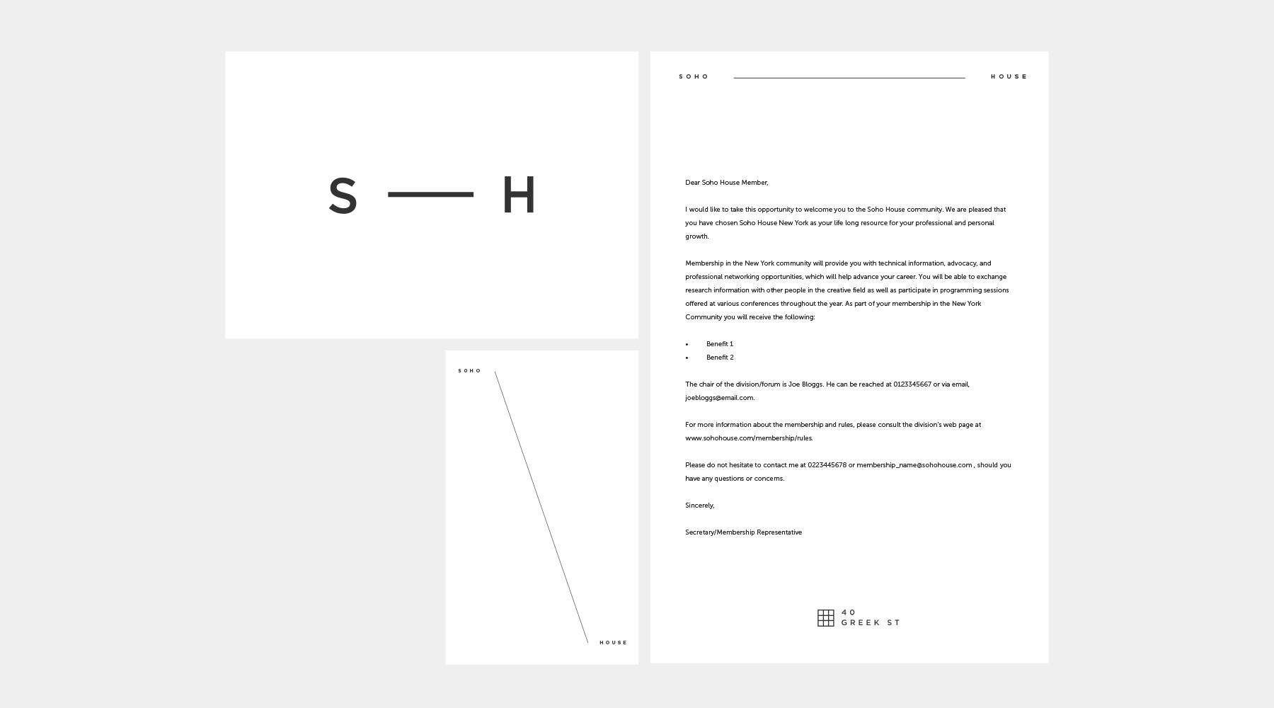
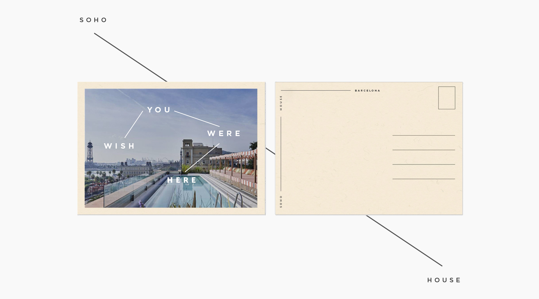
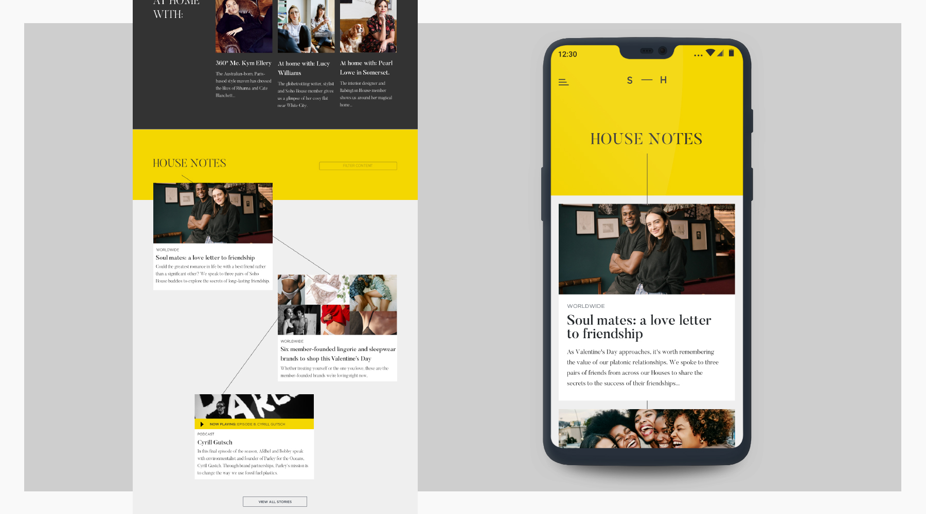
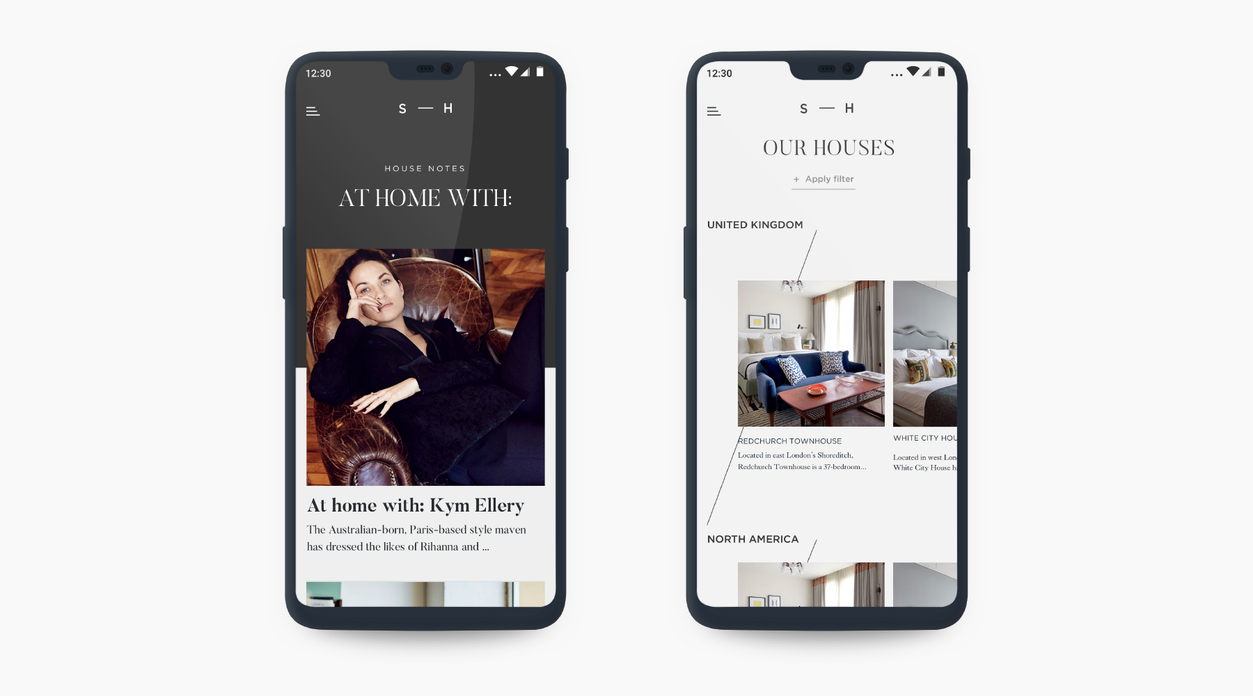
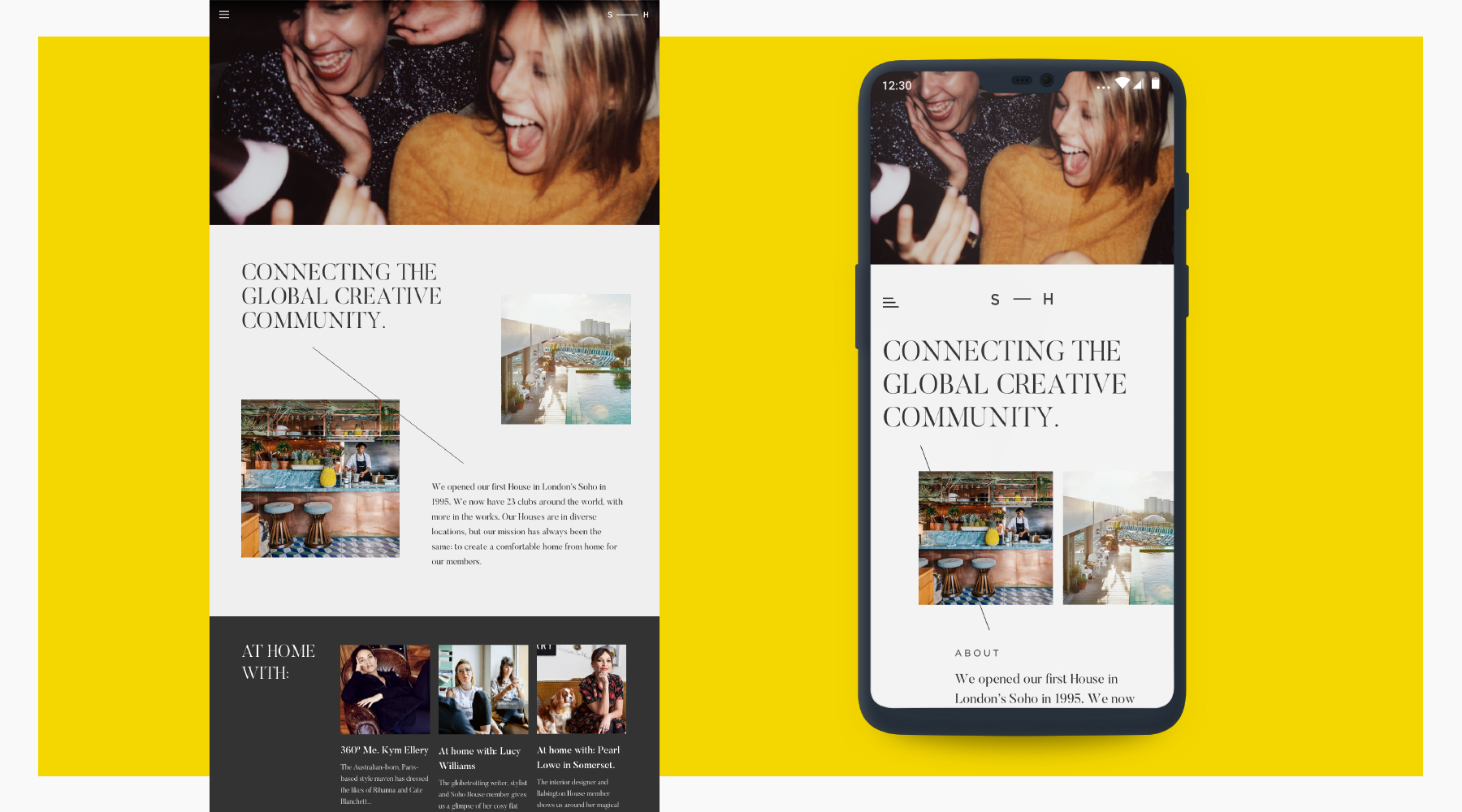
The identity reduces Soho House to its initials, joined by a bar that can extend to fit its space. Connection becomes the organising idea, rather than simply a line in the story.
The applications below explore how that device could carry across the brand and its digital touchpoints.
A Bastion
of Creativity.
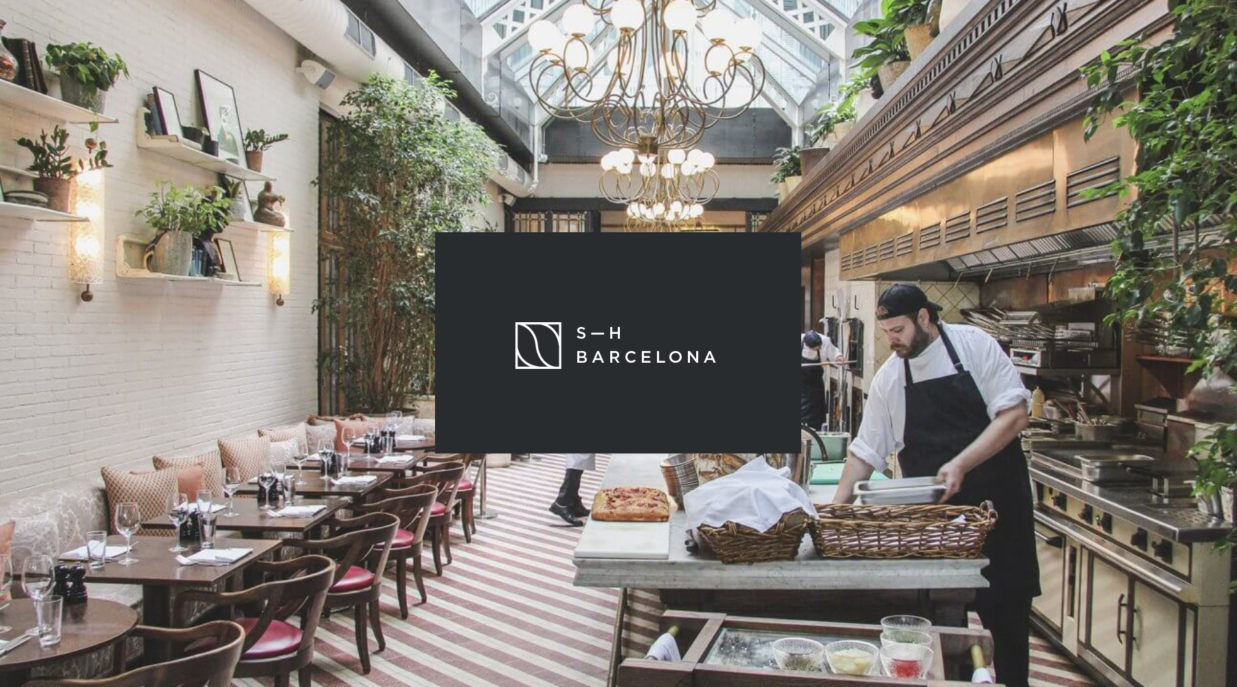
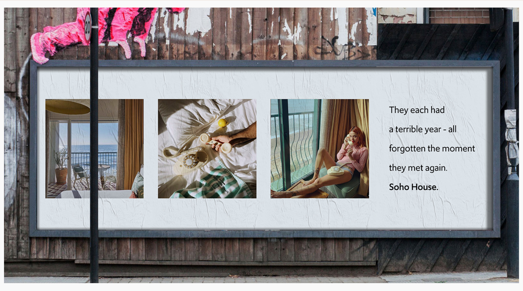
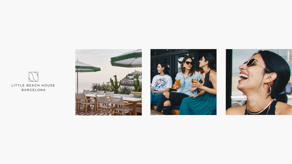
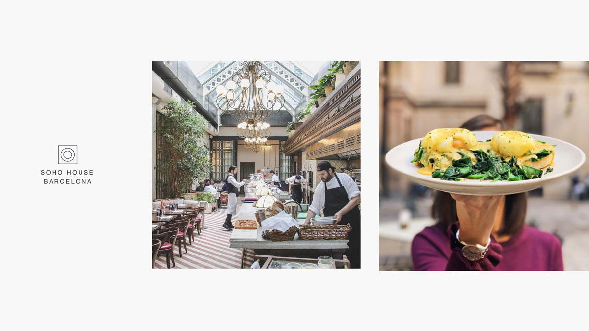
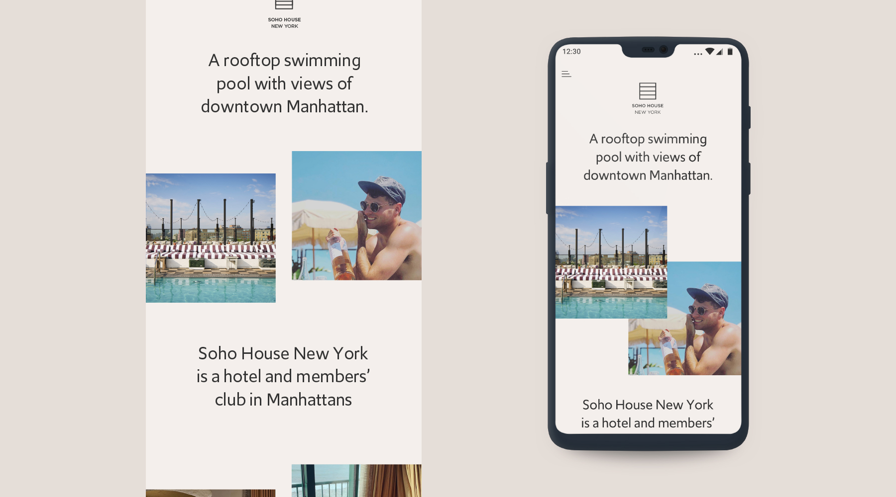
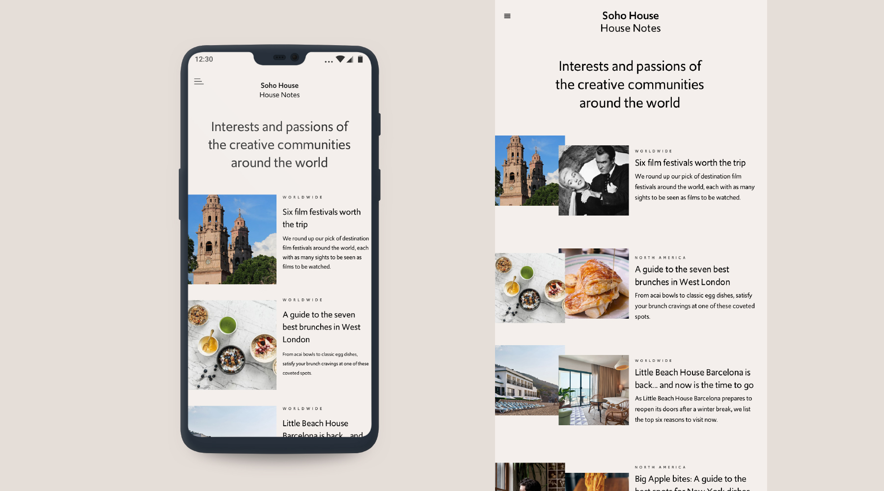
A more editorial direction, using photography and writing to suggest the experience of being there.
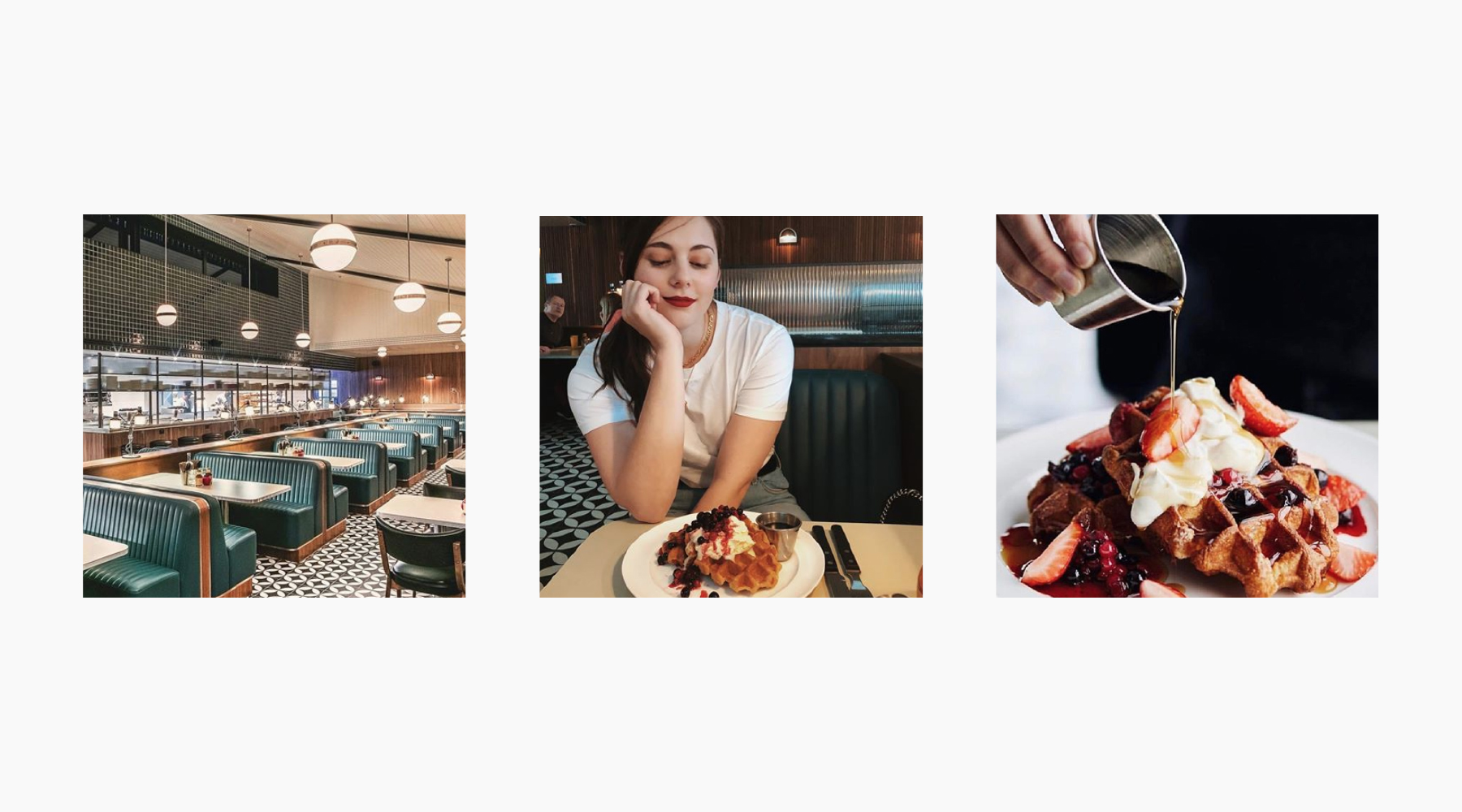
A few details.
A story of your own.
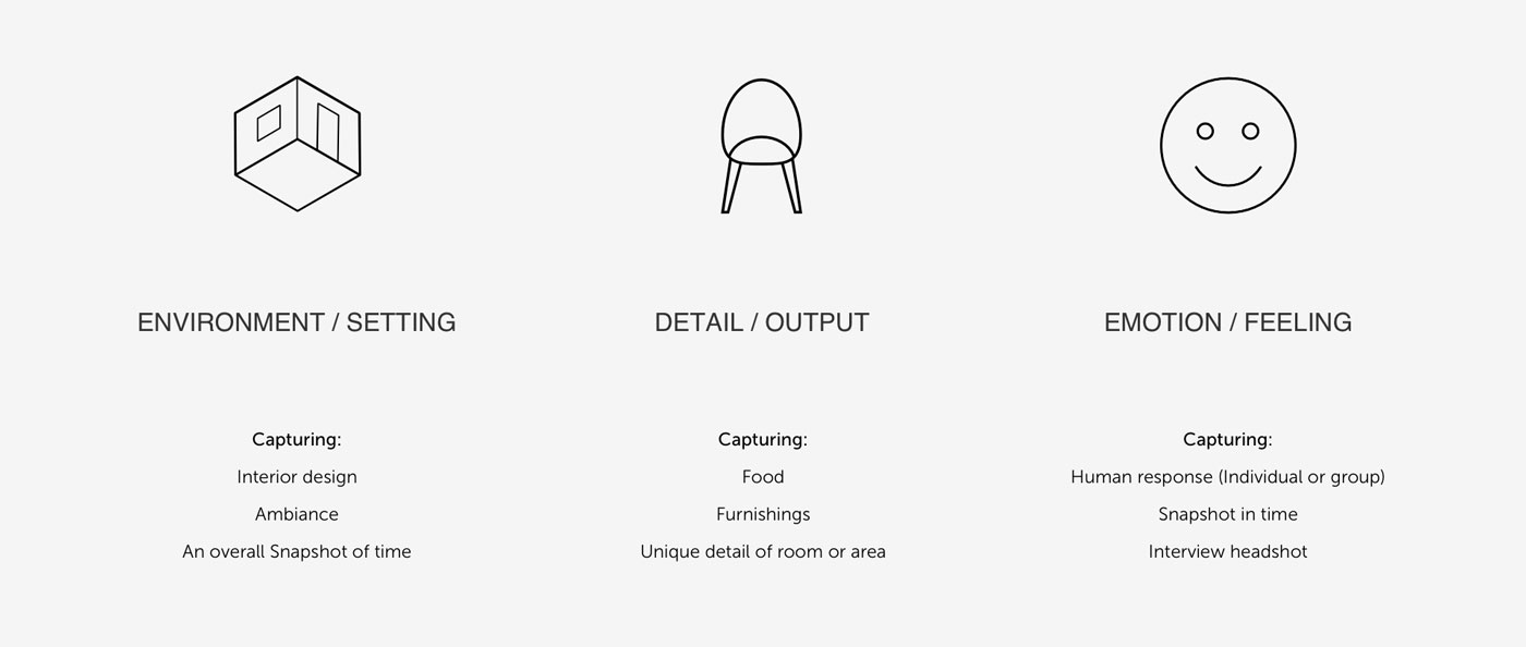
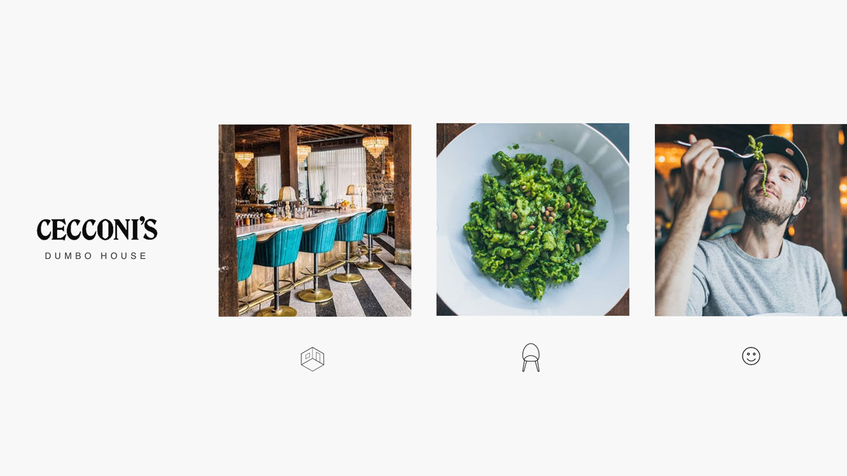
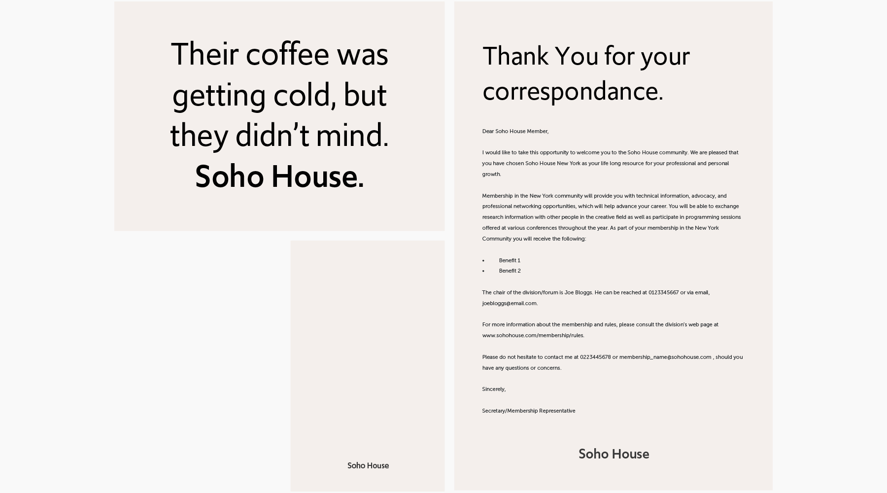
This direction pairs photography with creative writing. A setting, a detail and an emotion combine into a story, leaving room for the viewer’s own interpretation.
Where the first concept makes connection explicit, this one explores atmosphere. The work below shows how those fragments could become a distinctive digital expression.

From how it works
to how it feels.
This project brings together two sides of experience design: the research and structure that make a digital platform useful, and the creative expression that makes it recognisable.
The two concepts are presented as explorations. They show different ways of answering the same brief, grounded in the discovery that came before them.
Editorial notes for final review ↗
- Add project dates, collaborators and James’s specific responsibilities in each phase.
- Add an example of a research finding that changed the direction, if available.
- Confirm which work progressed beyond the concept stage. No launch or commercial outcome is claimed here.